
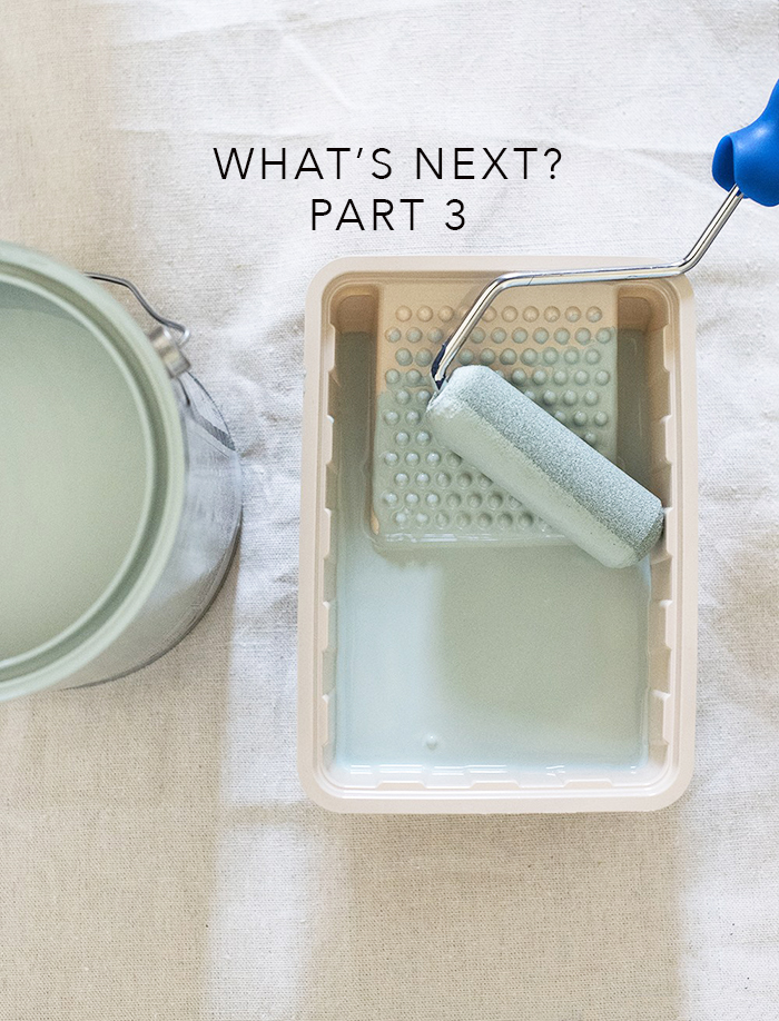
Color trends 2020. Hmmmm, like everything else this year, it has evolved. Our home is not only our sanctuary, but it has also been transformed into our coffee shop, gym, office, and on and on it goes. Given that, perhaps there’s been some rethinking for color trends since the initial predictions for 2020.
Dare we ask “what’s next?” There’s the philosophy that suggests we should surround ourselves with soft hues that reflect nature to keep us calm and sooth our souls. There’s another school of thought, that bright and bold tones will not only cheer us up, but give us reassurance and confidence. Since all color comes from nature, there’s certainly a good argument for either. Let’s explore both…
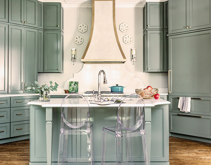
Center sage. In this kitchen, our color selection pushes the envelope beyond the traditional ivory and taup-ish shades of yore. Interestingly enough, the paint color is called “Retreat” by Sherwin-Williams. Our friends at Traditional Home described it as “luscious color with a fresh flavor.” We would agree. See more about this kitchen featured in the Traditional Home Fall 2020 issue. Thanks Trad Home! 🙌
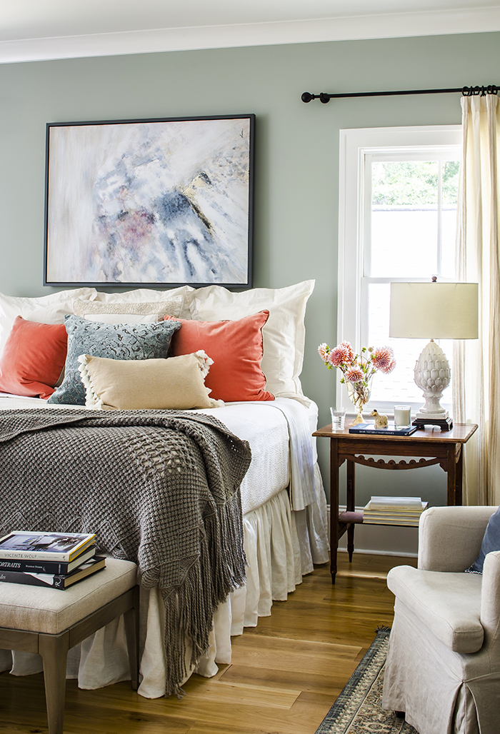
Green and serene. Speaking of sanctuaries, the same hue (Sherwin-Williams Oyster Bay), can represent harmony and balance in your ultimate retreat. Exhale. 😴
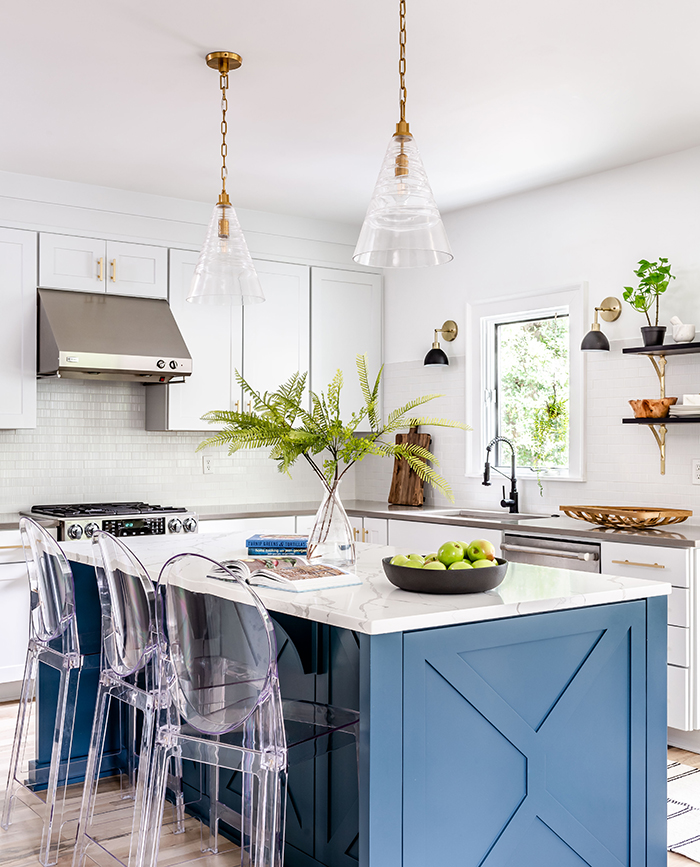
Blue for the blues. Blue is notoriously known for having a calming effect on our brains, making us feel safe and comfortable. This Sherwin-Williams shade appropriately named “Bunglehouse Blue” is perfect for this bungalow kitchen. Seasoned with love. 💙

Boom! “Framboise” by Sherwin Williams is bold, cheerful and certain to get your attention. We LOVE, love this raspberry built-in that confidently transformed this guest room. Don’t be shy. 💃🏼

Sunny side up. How happy is this yellow vanity, painted “Solaria” by Sherwin Williams, paired with this super fun wall covering from Spoonflower? Spoonflower products are eco-friendly, made-to-order and backed up by a Happiness guarantee. Swimmers take your mark. 🏊🏼♀️
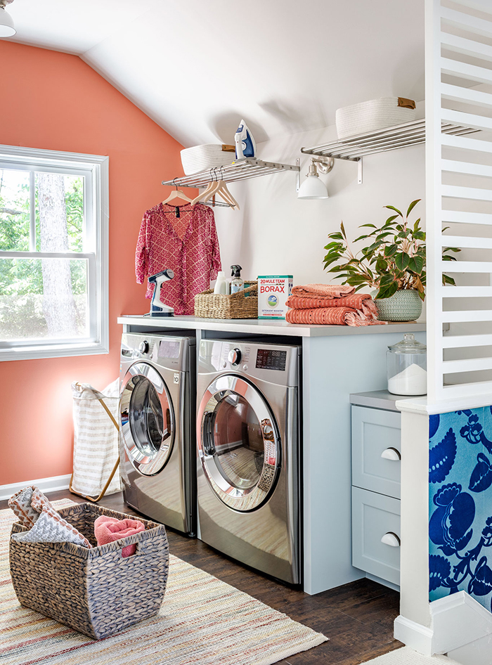
A colorful load. A laundry room is the perfect space to soak in color, making the task of doing the wash a pleasant chore. This “Ravishing Coral” by Sherwin Williams is fade resistant when it comes to making you smile. Let the sunshine in. 🌞
At the end of the day, our advice is to select a color palette that is unique to your emotions and well-being. Having said that, never, ever be afraid to have a little fun. 😁
Thanks to Jeff Herr for the amazing images and roomfortuesday.com for the inspiration image.