
Drum roll. The 2021 Sherwin Williams Color of the Year is —URBANE BRONZE.
Sherwin-Williams’ director of color marketing Sue Wadden and her team made their selection in February, “based on the precipice of the world falling apart.” Here we are, at the end of September and despite all the chaos, the paint brand’s team of color consultants are sticking with that versatile hue, determining that the color’s connection to the earth could help elevate the home as a sanctuary amid turbulent times. Referred to as equal parts trendy and timeless, Urbane Bronze was chosen in hopes to exemplify our connection with nature.

One of our faves, we graced this exterior trim with the one and only, SW 7048 Urbane Bronze!
The announcement revealing the “Color of the Year” is a big event in our world…sort of like that favorite movie scene in the Devil Wears Prada about Cerulean Blue and how it represents “millions of dollars and countless jobs.”
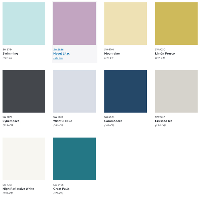
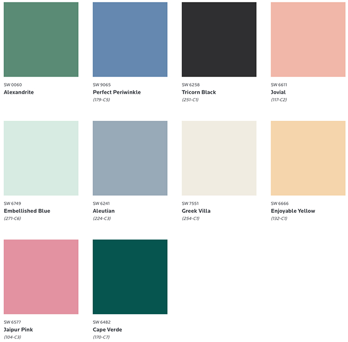
—Seriously, oodles of design research goes into this coveted color. 🤓 Our buddies at Sherwin-Williams have a party of 13 professionals known as the Color Forecast Team, devoted to travel the globe to track color’s shifting currents. The 2021 ColorMix forecast, lives in the rainbow of what they call the rhythm of color, broken down into 4 different palettes, with lovely depictions of each. 🎨 Let’s take a look…
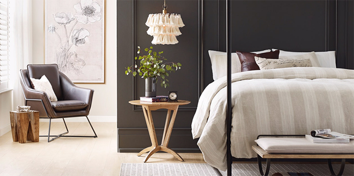
Sanctuary. We’re all starved for wellness and calm right? This palette is ALL about nurturing hues and warm neutrals. Think terms like nesting, wellness, warm minimalism and Scandi Design. Back to nature with less being more. Feel’s cacoon-ish in a modern way.

Encounter. Rich but muted tones that reinforce the importance of heritage and the value of simple, meaningful experiences. Rooted in culture, this palette focuses on the artisan craft that creates a sense of place. Influences connected to these hues are described with buzz words like modern bohemian, hyperlocal, and storytelling. This group represents perfect proportions of mood, earthiness and character.


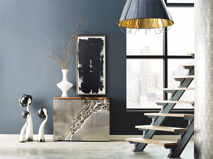
Continuum. Looking forward, this palette of white, charcoal and pops of color signifies change, as we confidently move toward the future without hesitation. A hybrid of synthetic and natural, it reflects Mid-Century Modern in a world where smart living through technology is at the touch of our fingertips and the sound of our voice. Thanks Alexa.
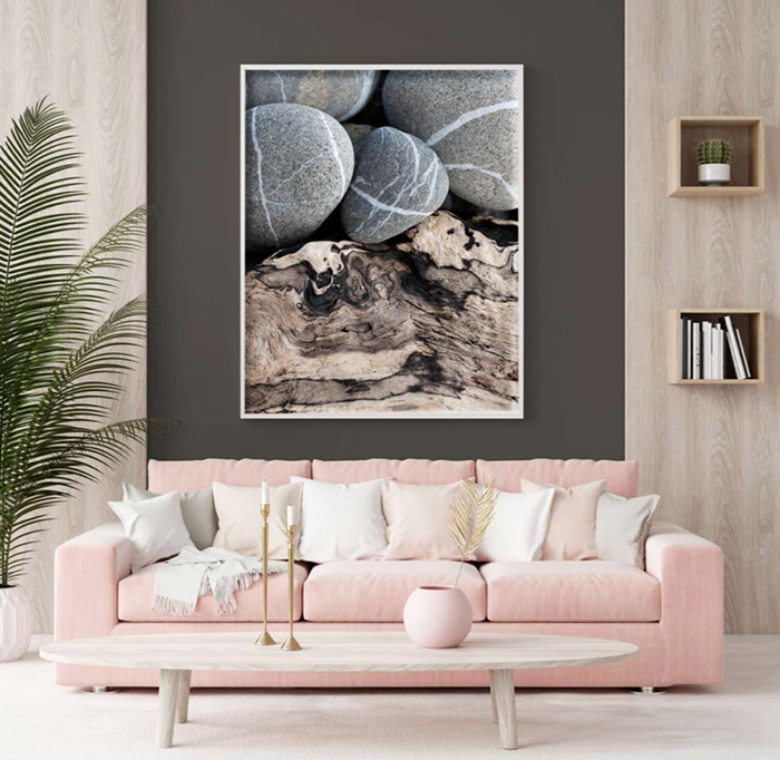
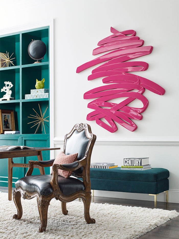
Tapestry. Wake up your senses with a splash from a carefully curated palette of lavish pinks and greens. Vibrant indeed. Classic with a cutting edge, this group leads the path to sensory exploration and creative expression. Why not?
Here’s to the new Color of the Year! 🙌🏼 We already loved this color for a long time, so don’t be surprised when you see this sophisticated shade showing up in the future once again.
Thanks to Sherwin-Williams for doing the research and choosing a color to please our senses in a calming capacity. We all deserve visual comfort in our world particularly as it applies to nurturing our connection to nature.
Thanks to Sherwin-Williams for the content and inspiration images, and Jeff Herr for the amazing exterior image.